As the graphic designer at 20/eight I am always on the lookout for inspirational color schemes to use for client projects. In choosing colors I always factor in a company’s current branding, competitor colors, theme of the promotion/project and time or season of the year.
Each color tells a story and can elicit specific emotions, in some cases without the use of a single word. The colors you choose will help determine how people perceive and interact with your brand, so it is important to do your homework. Always keep in mind that your personal preferences in color are not always the best choice for your design! My favourite color is pink. Pink is great for a nail salon as it is girly, fun and bright, however if I were creating a website for a mattress company, pink could come across as frivolous and might turn away potential clients – a light blue would probably be a better choice.
The first step to choosing colors is to brainstorm what message you want to send across to the viewer. It is also always a good idea to look at similar competitor brands or projects to see how they are using color combinations and get a feel for the overall tone. Most brands stick to one of three tones; a light tone – being white or pastel colors. A dark tone – being black or dark colored tones. And an electric or color pop tone – very bright colors with sharp contrast.
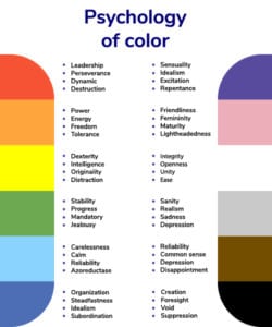
Once you know the message you want to convey and you have done your competitor research, it is also important to consider the psychological impact of colors:
• Red represents the color of blood, but can also give off feelings of energy, anger, danger, strength, power, desire and passion.
• Orange gives off the feelings of joy and sunshine, but can also show creativity, enthusiasm and success.
• Yellow is associated with sunshine and happiness but can also represent intellect and energy.
• Green is the color that represents nature, symbolising growth, harmony, freshness and fertility. Depending on the shade of green it can represent safety (light green) and money (dark green)
• Blue is often associated with water and the sky, but can also give the feelings of depth, stability, trust, loyalty, honesty, confidence and intelligence.
• Purple is often used to show royalty, it symbolises power, ambition, luxury, wisdom, independence, creativity and mystery.
• White is the color of simplicity and perfection, associated with light, innocence, purity and virginity.
• Black is associated with darkness, power, elegance, evil and death.

Putting Together your Color Palette
Typically, each color palette has around 3-5 colors: 1-2 main colors and a few secondary ones. Once you’ve picked your main colors, you need some secondary colors to make your main ones pop. The simplest way to make your main color pop is to use a bit of its complementary color alongside it.
A quick way to find a complementary color is to look at a color wheel and find the color directly across from it. A subtler way to make your main color pop is to use analogous colors with it, which are the colors beside it on the color wheel. Another favourite resource of mine is Adobe Color. Adobe generates color wheels based on keywords. From there you can edit the settings to show complementary and analogous colors to any of the colors you pick.
Once you have your colors you can begin putting some together to see how they look as a group. It is also important to see how they look against black and white. If you don’t like the combinations, go back and change up your secondary colors. There’s no wrong way to pick a color scheme.
Picking the perfect color palette takes time and lots of changes. Sometimes I end up changing my palette halfway through a project because it doesn’t show the message I want, or it is starting to look too messy. If you begin to feel lost in your colors just keep in mind what your main message is and look for inspiration, or ask for professional help!
As the Graphic Designer for 20/eight Digital (official title: Design Fairy) I often get questions from clients about colors for their messaging. In the end the client is the best judge of what works for their business, but it is my job to present them with inspiring options.
Do you have any questions for me?
Lana Souaid
20eight DIGITAL Design Fairy
